
What Does "Print-Ready" Actually Mean for Packaging?
A packaging design can look finished on screen but still not be ready for production.
Print-Ready vs Design-Ready vs Production-Ready
A design-ready file focuses on the visual layout. A print-ready file meets basic technical requirements such as bleed, colour mode, resolution, and fonts. A production-ready file goes one step further-it has been checked against the manufacturer's dieline, material, finishing process, and production requirements.
In packaging, "print-ready" is not always universal. A file accepted by one printer may still need adjustments for another manufacturer.
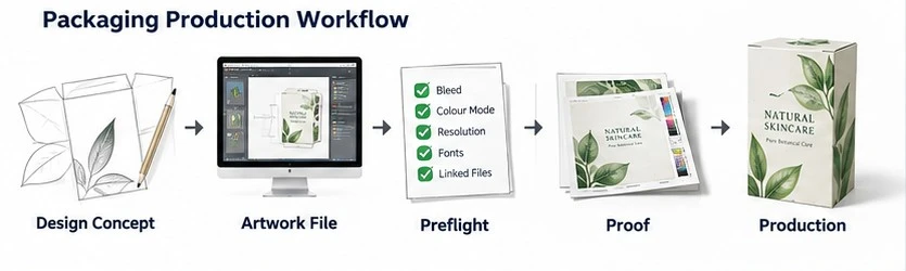
Design concept → Artwork file → Preflight → Proof → Production
Why Packaging Artwork Has Stricter Requirements Than Ordinary Print Files
Packaging artwork must work through more than printing. It also has to account for:
Cutting: artwork must extend correctly beyond cut lines.
Folding: logos and graphics must align across panels.
Gluing: important content should stay clear of glue areas.
Finishing: foil, embossing, spot UV, and similar effects may require separate layers.
Materials: colours can look different on kraft, coated, or coloured substrates.
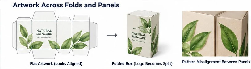
For example, a logo may look perfectly aligned on a flat dieline but appear split after the box is folded.
That is why packaging artwork should always be checked against the manufacturer's dieline before production.
Check #1 - Start With the Manufacturer's Dieline, Not Your Artwork
Always start with the manufacturer's final dieline. Your artwork must fit the actual structure, not the other way around.
What a Packaging Dieline Contains
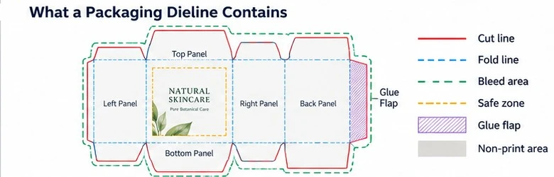
A typical dieline includes:
Cut line: final trim edge
Fold line: where the package bends
Bleed: extra artwork beyond the cut line
Safe zone: area for important text and logos
Glue flap: area used for assembly
Non-print area: space where key graphics should not be placed
Always follow the manufacturer's own dieline legend and specifications.
Why You Shouldn't Resize the Dieline Yourself
Scaling or redrawing a dieline can change panel sizes, fold positions, glue flaps, and final dimensions.
If the packaging size changes, ask the manufacturer for a new dieline instead.
What to Confirm Before Designing
Check these first:
final dieline and size
bleed and safe-zone requirements
material
colour requirements
finishing details
preferred file format
Confirming these details early helps avoid unnecessary artwork revisions later.
Check #2 - Verify Bleed, Safe Zones, and Panel Alignment
Once the dieline is confirmed, check how the artwork sits within it. Bleed, safe zones, and panel alignment all help prevent positioning problems during cutting and folding.
How Much Bleed Does Packaging Artwork Need?
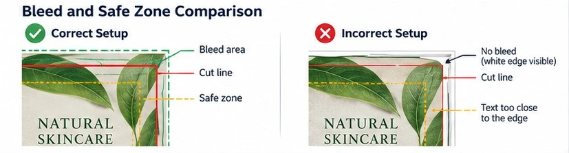
Around 3 mm of bleed is common, but the manufacturer's dieline should always take priority.
Bleed allows background colours and images to extend beyond the cut line, helping prevent unwanted white edges caused by cutting tolerance.
Keep Text, Logos, and Barcodes Inside the Safe Zone
Background graphics can extend into the bleed, but important elements should stay inside the safe zone, including:
logos
product names
mandatory text
barcodes
QR codes
This reduces the risk of important content being trimmed or placed too close to a fold.
Check Artwork Across Folds and Adjacent Panels
Always review how the flat artwork will look once the package is folded.
Watch for:
logos crossing fold lines
patterns that do not align between panels
text wrapping around corners
images split across panels
incorrect orientation on top or bottom panels
Artwork may look aligned on a flat PDF but appear very different on the finished package.
Check #3 - Make Sure Your Artwork Uses the Right File Structure
A file that opens correctly is not always production-ready. Packaging artwork should be easy to scale, edit, relink, and output without missing assets.
Vector vs Raster Artwork
Use the format that fits each element:
|
Element |
Preferred Format |
Why |
|
Logo |
Vector |
Stays sharp at any size |
|
Text |
Live text or vector |
Easy to edit and output cleanly |
|
Photo |
Raster |
Best for photographic detail |
|
Dieline |
Vector |
Keeps dimensions and lines precise |
The goal is not to make everything vector, but to use the right format for each type of artwork.
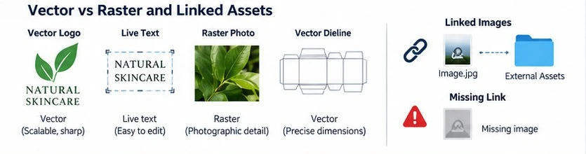
Linked vs Embedded Images
Linked images depend on external files. If you send an Illustrator or InDesign file without the linked assets, the printer may see missing images.
Depending on the workflow, you may need to:
embed the images
export an approved production PDF
Always follow the manufacturer's file submission requirements.
Why Changing JPG to PDF Does Not Make It Print-Ready
Converting a JPG into a PDF only changes the file container. It does not fix problems such as:
low resolution
RGB colour
missing bleed
flattened text
missing dielines
missing finishing layers
A PDF is only print-ready when the artwork inside it meets the required production specifications.
Check #4 - Inspect Image Resolution at the Actual Print Size
Do not judge image quality by the DPI number alone. What matters is the effective resolution at the final print size.
What 300 DPI Really Means
An image may start at 300 DPI, but enlarging it reduces its effective resolution.
For example, if you scale a 300 DPI image to 200%, its effective resolution drops to about 150 DPI.
Always check resolution at the actual size used in the packaging artwork.

Why Upscaling Does Not Always Fix Low-Resolution Artwork
Upscaling can increase pixel dimensions, but it cannot always restore missing detail.
This is especially important with AI-generated artwork. Images may look sharp on screen but show soft edges, artefacts, or unstable details when enlarged for printing.
Upscaled artwork should still be checked at the final print size.
When Raster Artwork Is Acceptable
Raster artwork is perfectly suitable for:
product photos
photographic images
complex textures
photorealistic graphics
The key is to check resolution, colour mode, scaling, compression, and compatibility with the printer's workflow.
Raster is not the problem-poorly prepared raster artwork is.
Check #5 - Control Colour Before the Printer Does It for You
Colour accuracy depends on more than simply converting artwork to CMYK. The final result is also affected by the substrate, ink, coating, proofing method, and printing process.
RGB vs CMYK
Screens display colour in RGB, while most conventional printing processes use CMYK inks. Because the two colour spaces have different gamuts, bright blues, greens, purples, and other highly saturated RGB colours may look duller after conversion.
For packaging artwork, the key is to check how important brand colours behave in the actual print workflow rather than assuming the screen version will reproduce exactly.
When to Use Pantone or Spot Colours
Pantone or other spot colours are useful when a brand colour needs tighter consistency or when a colour is difficult to reproduce accurately with standard CMYK.
They may also be required for special inks or specific printing processes.
However, a Pantone reference does not guarantee an identical result on every material. Coated board, uncoated stock, kraft paper, and coloured substrates can all change how the same ink appears.
Why CMYK Conversion Alone Cannot Guarantee Colour Matching
Even correctly prepared CMYK artwork can print differently because several production variables affect colour:
Substrate: White, kraft, and coloured materials change the visual result.
Ink and print process: Different systems can reproduce the same colour values differently.
Coating or lamination: Gloss and matte finishes can change perceived saturation and contrast.
Monitor: Screen brightness and calibration may not reflect printed colour accurately.
Proofing: A digital proof is useful for layout, but not always for judging exact physical colour.
When colour is critical, confirm it using the intended material and consider a physical proof or sample.
Why Kraft and Coloured Materials Change Printed Colours
Packaging material is part of the final colour result.
Many inks are not fully opaque, so the substrate underneath can influence the printed appearance. A colour that looks bright on white board may appear darker or more muted on kraft paper.
On dark or coloured materials, a white underprint may be needed to help certain colours remain visible and closer to the intended artwork.
The key is to review colour together with the actual substrate rather than judging the design only on a white screen.
Once colour and material have been checked, the next step is to review fonts, small text, and fine lines for production safety.

Check #6 - Export the Final Production File Correctly
A production-ready file should be easy for the printer to open, review, and process without guessing which version, layer, or asset to use.
PDF vs AI vs EPS
There is no single best file format for every packaging project. The right choice depends on the manufacturer's workflow and whether they need to make prepress adjustments.
|
Format |
Best use |
Main risk |
|
|
Final print-ready output |
Limited editability if corrections are needed |
|
AI |
Editable packaging artwork |
Missing linked images or fonts |
|
EPS |
Legacy vector workflows |
Limited support for some modern transparency and effects |
PDF is commonly used for final production files because it is portable and preserves artwork well. However, some manufacturers may also request the native AI file so their prepress team can adjust dielines, spot colours, or finishing layers if necessary.
The safest approach is to ask which packaging artwork file format the supplier prefers before sending the final files.
Which PDF Standard Should You Use?
Different prepress systems may handle transparency, colour management, and other PDF features differently. Instead of choosing a preset based on a generic online recommendation, follow the manufacturer's production specification.
Before export: ask whether the supplier provides a preferred PDF preset or artwork specification sheet.
This is more reliable than assuming one PDF/X standard will work for every printer.
Final Layer and Naming Check
Before sending the file, make sure the artwork is easy for the prepress team to understand.
Check that:
the dieline is on a clearly named layer
main artwork and finishing layers are separated
foil, Spot UV, white ink, or other special layers are clearly labelled
hidden or unused layers are removed where appropriate
linked assets are included or embedded as required
only the approved file version is included
the filename clearly identifies the project and version
Clear file structure and naming reduce handoff errors and make the final preflight faster and easier.
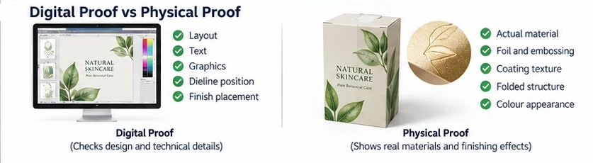
Digital Proof vs Physical Proof: What Should You Approve Before Production?
Preflight checks whether the file is technically ready. Proofing checks whether the expected result is acceptable before production.
What a Digital Proof Can Verify
A digital packaging proof is useful for checking:
text and spelling
graphics and position
panel orientation
dieline relationship
finish placement
It is ideal for catching layout errors, but it should not be treated as an exact reference for final colour or material appearance.
What It Cannot Reliably Verify
A digital proof cannot fully show:
actual substrate colour
tactile feel
exact printed colour
foil reflectivity
emboss depth
coating texture
final folding and fit
These details are better evaluated with a physical sample.
When a Physical Sample Is Worth the Cost
A physical packaging sample is especially useful for:
high-volume orders
premium products
new structures or materials
critical brand colours
complex finishes
packaging that requires a precise fit
For low-risk repeat orders, a digital proof may be sufficient. For new or complex projects, a physical sample can reduce uncertainty before mass production.