
First, Define What "Color Matching" Actually Means
Before discussing proofs, Pantone colors, or QC, it helps to define what "color matching" actually means in packaging production.
For buyers, saying the final packaging should be "the same color as the sample" sounds clear, but it leaves key questions unanswered: Which sample is the approved reference? How much variation is acceptable? And how will that difference be evaluated?
Reliable packaging color matching requires more than visual similarity. It needs a clear reference, an agreed printing color tolerance, and a repeatable method for checking color consistency.
Exact Visual Identity vs. Commercially Acceptable Consistency
A color match does not always mean two printed pieces will look absolutely identical under every condition.
Buyers often mix together three different ideas:
Digital screen matching: whether print resembles what appears on a screen.
Visual similarity: whether two physical samples look similar side by side.
Measurable production tolerance: whether production stays within an agreed range against an approved reference.
These are not the same.
"Match the sample" is less precise than specifying a Pantone color, approving a physical reference, and defining an acceptable tolerance.
In practice, effective color control depends on:
an agreed reference;
a defined tolerance;
a repeatable QC method.
That is why "same as sample" or "same as the artwork" is often too vague for color-critical packaging.
The next question is whether a screen can serve as that production reference.
Why Screen Color Should Never Be the Production Reference
A screen is useful for reviewing artwork, but it should not be the final reference for printed packaging color.
Screens create color with emitted light, usually in RGB. Printed packaging is viewed through reflected light, with the result affected by ink, substrate, surface texture, and finishing.
Some bright or highly saturated RGB colors fall outside the range standard CMYK printing can reproduce. During RGB-to-CMYK conversion, they may appear duller, darker, or less saturated.
Screens also vary in brightness, calibration, and display settings, so the same artwork may look different on two devices.
Common mistake: Approving packaging color from a screenshot, phone photo, or uncalibrated monitor.
A screen is useful for layout and general visual review, but not as a reliable standard for final packaging print color approval.
Once a physical or standardized reference is established, the next question is how much variation is acceptable.
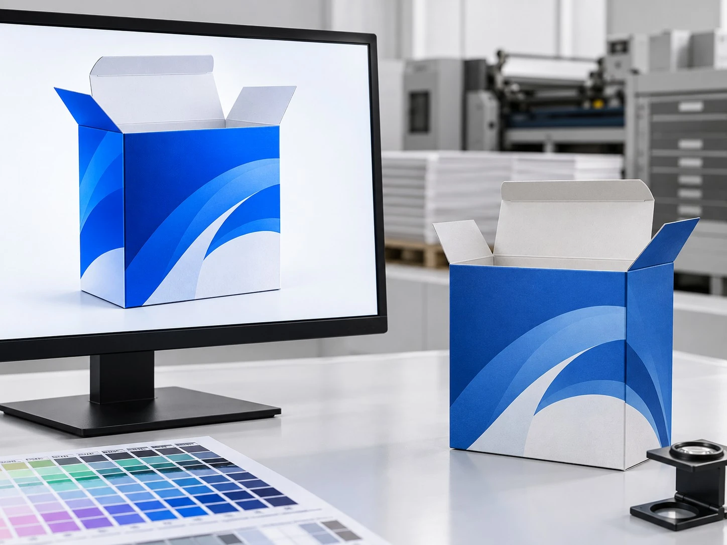
How Delta E Helps Turn "Looks Different" Into a Measurable Tolerance
Terms such as "slightly darker" or "not quite the same blue" are too subjective for production control.
Delta E (ΔE) measures the difference between two colors. In general, a lower value means a closer measured match, while a higher value indicates a greater difference.
A spectrophotometer can be used to compare production output with an approved reference, turning subjective judgment into measurable QC data.
What is Delta E?
Delta E is a numerical measure of color difference used to make color evaluation more objective.
However, there is no single Delta E value that defines an acceptable result for every packaging project. The required color tolerance depends on factors such as the brand standard, substrate, printing process, measurement method, and agreed specification.
| Delta E concept | What it generally means |
|---|---|
| Lower ΔE | Closer measured color match |
| Higher ΔE | Greater measurable difference |
| Required tolerance | Depends on the project, substrate, process, and QC specification |
Delta E should therefore be treated as a color-control tool, not a universal guarantee of perfect matching.
The key is to agree on the reference and acceptable tolerance before mass production begins. Even then, color can still shift during artwork preparation, proofing, material selection, finishing, and production.
CMYK or Pantone? Choose the Right Color System Before Proofing
The right choice between CMYK and Pantone depends on what the packaging needs to achieve. The question is not which system is "better," but which one gives the project enough color control without adding unnecessary cost.
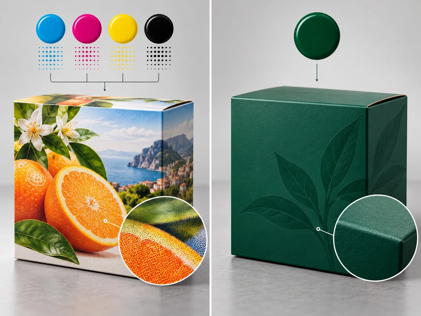
When CMYK Is Sufficient
CMYK packaging printing is usually sufficient for artwork built around photography, gradients, multi-color graphics, or designs without a highly sensitive brand color.
It can also be the practical choice when:
the artwork is already designed for process color;
exact reproduction of one specific brand color is not critical;
the project is cost-sensitive;
normal production tolerance is acceptable.
CMYK can deliver consistent results when the file, substrate, proofing, and press conditions are properly controlled. However, some highly saturated or brand-specific colors may still be difficult to reproduce precisely with four process inks.
CMYK may be sufficient if:
your design contains many colors rather than one critical spot color;
photographic reproduction matters more than exact logo-color matching;
your brand guidelines do not require a specific Pantone reference.
If one or two colors carry unusually high brand importance, process color may not be the best control method.
When Pantone Is Worth the Additional Cost
Pantone printing becomes more valuable when a specific color needs to remain recognizable and consistent across packaging runs or product lines.
Typical cases include:
logos and hero brand colors;
large solid-color areas;
luxury packaging;
multiple SKUs that need consistent branding;
strict brand guidelines.
A Pantone spot color provides a more clearly defined target than approximating the same color through a CMYK build.
For example, if a beauty brand uses the same distinctive pink across several packaging formats, Pantone color matching may offer more useful control than relying on different CMYK combinations for each job.
That does not mean Pantone guarantees a perfect visual match in every situation.
Pantone provides a clearer target, but it does not remove every physical variable.
Why Pantone Still Does Not Eliminate Substrate Effects
The same Pantone code can look different on different materials because the ink still interacts with the substrate.
Important variables include:
the substrate's base color;
coated versus uncoated surfaces;
ink absorption;
opacity;
lamination or other finishing.
For example, the same Pantone ink can appear cleaner and brighter on white coated board than on natural kraft, where the brown base color influences the final appearance.
In other words, Pantone improves color control, but it does not override substrate physics.
| Factor | CMYK | Pantone |
|---|---|---|
| Best for | Photos, gradients, multi-color artwork | Critical brand colors and solid areas |
| Color control | Good for process-color designs | More defined target for specific colors |
| Cost implication | Usually more economical | May add ink and setup cost |
| Main limitation | Some colors are difficult to reproduce precisely | Final appearance still depends on substrate and finishing |
| Recommended use | General packaging graphics | Brand-critical or highly controlled colors |
Once the target color system is defined, the next step is choosing a proof that can actually verify the right aspects of the final packaging.
Not All Proofs Prove the Same Thing
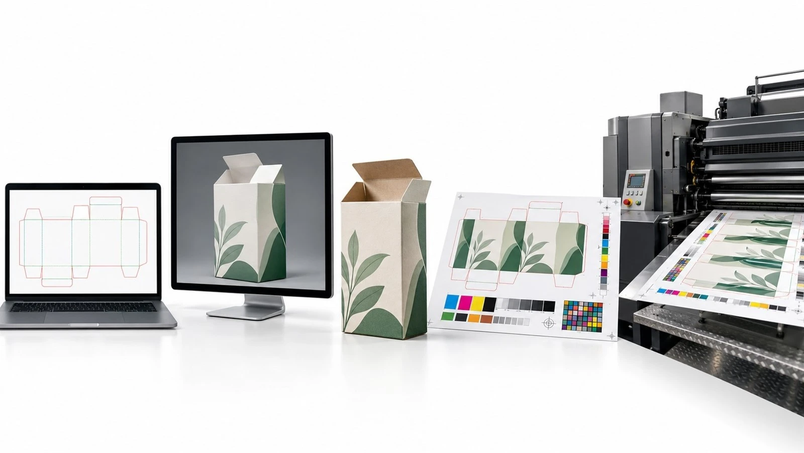
A proof is useful only if you know what it is intended to verify. Some proofs are designed to check layout and artwork, while others are better for evaluating color, substrate, or final production conditions.
PDF / Soft Proof
A soft proof is useful for checking:
text and artwork content;
placement;
dieline alignment;
general layout.
It does not reliably confirm final printed color, paper behavior, or finishing effects.
A common mistake is treating PDF approval as final color approval. Use it mainly for content and layout checks.
3D Digital Mockup
A 3D mockup helps buyers review:
overall appearance;
panel placement;
structural presentation;
visual concept.
However, it cannot accurately verify physical material color, ink density, or actual finishing behavior.
A realistic render can look convincing, but it is still simulated.
Digital Physical Sample
A physical digital sample can provide more useful information about:
size;
structure;
tactile feel;
overall visual direction.
Its value for color approval depends on whether it uses the same substrate, printing process, inks, and finishing as mass production.
A useful buyer question is:
Was this sample produced using the same print process, paper, and finishing as the bulk run?
A digital sample vs. mass production comparison is only meaningful when those production differences are understood.
Contract Color Proof
A contract color proof is designed to provide a more controlled and calibrated color reference than a general digital sample.
It can be useful for:
evaluating color more accurately;
approving a standardized color target;
color-critical projects that do not yet require a full press setup.
However, it may still not reproduce every effect created by the final substrate, ink behavior, or finishing.
Wet Proof / Press Proof
A wet proof or press proof provides a closer representation of actual production because it can use production-equivalent materials, inks, press conditions, and finishing.
It is especially useful when the buyer needs to verify the real production combination rather than a simulated result.
The trade-off is higher setup cost and more time, which may make it unnecessary for lower-risk projects.
| Proof type | Best for verifying | Does not reliably verify | Relative cost | Recommended when |
|---|---|---|---|---|
| PDF / soft proof | Text, layout, dielines | Final print color, substrate, finishing | Low | Content approval |
| 3D mockup | Visual concept and structure | Physical color and material behavior | Low | Design presentation |
| Digital physical sample | Size, structure, general appearance | Exact mass-production color if processes differ | Medium | Structural and visual review |
| Contract color proof | Controlled color target | Every substrate or finishing effect | Medium | Color-sensitive projects |
| Press proof | Production-like color and material behavior | - | High | High-risk or color-critical packaging |
Even with the right packaging proofing strategy, mismatches can still occur. The next step is to diagnose the pattern rather than assign blame immediately.
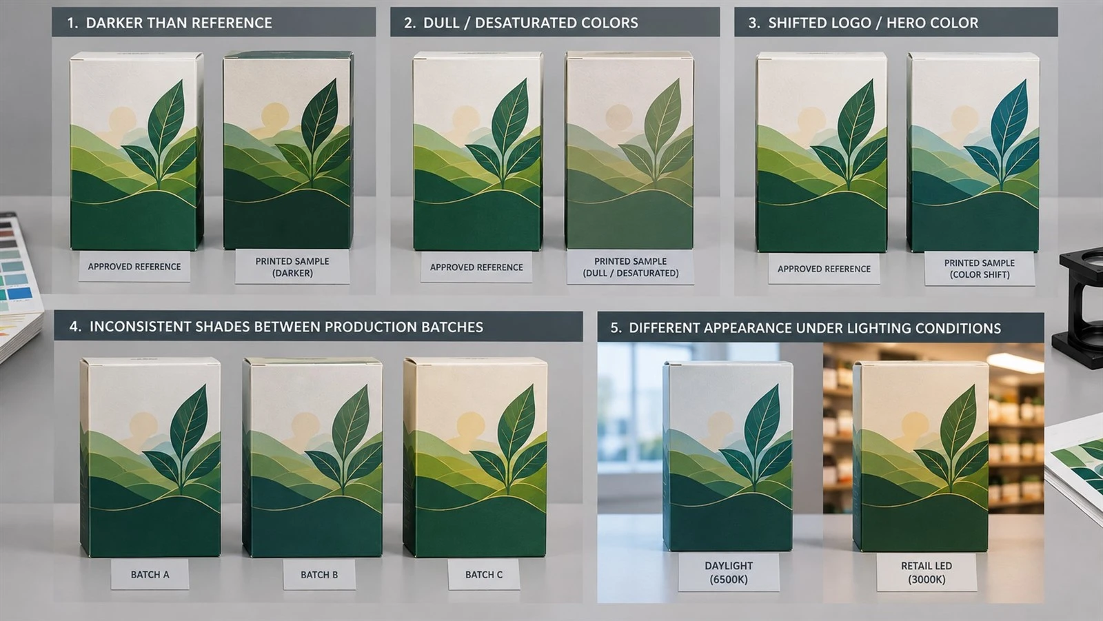
How to Diagnose a Color Mismatch Before Blaming the Printer
When a packaging color mismatch appears, the fastest way to find the cause is to start with the symptom, not with assumptions about who made the mistake.
Different visual problems usually point to different causes. The goal is to identify what changed, check the most likely variables first, and then decide what corrective action is appropriate.
If the Bulk Order Is Darker
If the bulk printing is darker than the sample, several factors may be responsible:
dot gain;
a more absorbent substrate;
higher ink density;
matte coating;
a proof produced with a different printing method.
Do not rely only on photos or screen comparisons. First confirm whether the sample and production pieces use the same material, finishing, and approved reference.
Then check whether the difference has been measured or is based only on visual judgment.
First checks:
Same substrate?
Same finishing?
Same approved physical reference?
Measured against the agreed target?
A darker result does not automatically mean the printer simply "used too much ink."
If Bright Colors Become Dull
When bright blues, greens, or highly saturated colors lose intensity in print, the first place to look is often the artwork and color gamut.
Possible causes include:
RGB artwork;
out-of-gamut colors;
RGB-to-CMYK conversion;
absorbent paper;
matte finishing.
For example, a highly saturated blue that looks vivid on screen may become noticeably flatter once converted to CMYK and printed on uncoated board.
If CMYK colors look dull, check whether the original artwork contained colors that the selected printing process cannot reproduce at the same saturation.
If One Brand Color Shifts
If most of the artwork looks acceptable but one logo or hero color appears wrong, the problem is more likely to be related to how that specific color is defined and controlled.
Check:
the CMYK build;
whether a Pantone reference was specified;
the substrate;
the approved proof;
whether the color is printed as process color or spot color.
A brand color mismatch does not automatically mean Pantone is required, but Pantone may provide a clearer target when one specific color has high branding importance.
The key question is whether the approved reference and production method are precise enough for that color.
If Samples Match but Batches Do Not
A good first production run does not guarantee that future runs will match automatically.
If one batch looks correct but the next does not, check:
whether the original approved reference was retained;
ink formulation;
substrate batch;
production QC records;
color measurements from previous runs.
For repeat orders, the master sample or approved reference should remain part of the production specification.
Buyers should also keep the same Pantone reference, artwork version, substrate specification, and QC criteria across repeat orders whenever possible.
This helps reduce batch color variation and makes it easier to identify whether a later change came from the material, ink, press setup, or production control.
If Color Changes Under Different Lighting
Sometimes a package looks correct in one environment but noticeably different in another.
This can happen because the light source affects how the color is perceived. Different inks and materials can also respond differently under daylight, office lighting, or retail LEDs.
This effect is often associated with metamerism, where two colors appear to match under one light source but not under another.
For color-critical packaging, approvals should therefore use agreed viewing conditions rather than random office or phone lighting.
For example, a package that looks neutral under daylight may appear warmer or cooler under retail LED lighting.
Quick Color-Mismatch Troubleshooting Guide
| Symptom | Likely cause | What to check first | Corrective action |
|---|---|---|---|
| Bulk print is darker than the proof | Dot gain, ink density, substrate, matte finish | Material, finish, approved reference | Compare against the target and adjust process controls |
| Bright colors look dull | RGB gamut loss, CMYK conversion, substrate | Artwork color space | Review print-ready color values and proofing method |
| One brand color looks wrong | CMYK build, spot-color choice, substrate | Color specification | Confirm Pantone or approved color target |
| Repeat batches do not match | Calibration, ink, substrate batch, QC drift | Previous master sample and QC records | Restore the approved reference and production controls |
| Color changes under different lighting | Viewing condition, metamerism | Light source | Standardize evaluation conditions |
| Sample looks right but production does not | Different proof and production methods | Printing process used for each | Reassess whether the proof was suitable for color approval |
Diagnosis helps after a mismatch appears. A better procurement process reduces the chance that the mismatch happens at all.
The Pre-Production Color Approval Workflow
A reliable color result depends on making the right decisions before production starts. The goal is to lock each critical variable, assign a clear approval point, and keep a usable reference for QC.
Step 1 - Lock the Substrate
Confirm the final production material before approving color.
Lock:
substrate type;
grade;
surface;
base color;
production-equivalent material.
The approved material specification should match what will actually be used for mass production.
Step 2 - Lock the Color Specification
Replace vague instructions such as "same blue" with a defined target.
Use:
CMYK values;
Pantone code;
approved physical reference;
agreed tolerance where required.
Do not use a screenshot or phone photo as the production color reference.
Step 3 - Select the Correct Proof Level
Choose the proof based on project risk.
Consider:
how critical the color is;
order value;
whether the substrate is new;
whether the printing process has been used before.
Use the proof comparison framework to select the appropriate level rather than automatically requesting the most expensive option.
Step 4 - Approve a Physical Reference When Color Is Critical
For color-sensitive projects, keep a clearly approved physical target such as:
a signed production-equivalent sample;
an approved contract proof;
an approved press proof.
The key is not only approving it, but retaining it for production use.
Step 5 - Define Tolerance Before PO Approval
Agree on acceptable variation before mass production begins.
Confirm:
the measurement method;
approved reference;
color tolerance;
viewing condition where relevant;
what happens if production falls outside tolerance.
Do not wait until the goods arrive to decide what "acceptable" means.
Step 6 - Keep the Approved Reference for Production QC
The approved reference should follow the job into production.
Press operators or QC staff should compare production against the correct target, and the same reference should be retained for repeat orders.
Also keep artwork revisions under control. Avoid multiple files named "final," "final-new," or "final-final" without clear version approval.
Workflow at a Glance
Lock substrate → Approved material specification
Lock color target → Approved color specification
Choose proof level → Defined approval method
Approve physical reference → Production target retained
Define tolerance → Clear acceptance criteria
Use reference in QC → Repeatable production control
A good process still depends on whether the supplier can actually execute it.
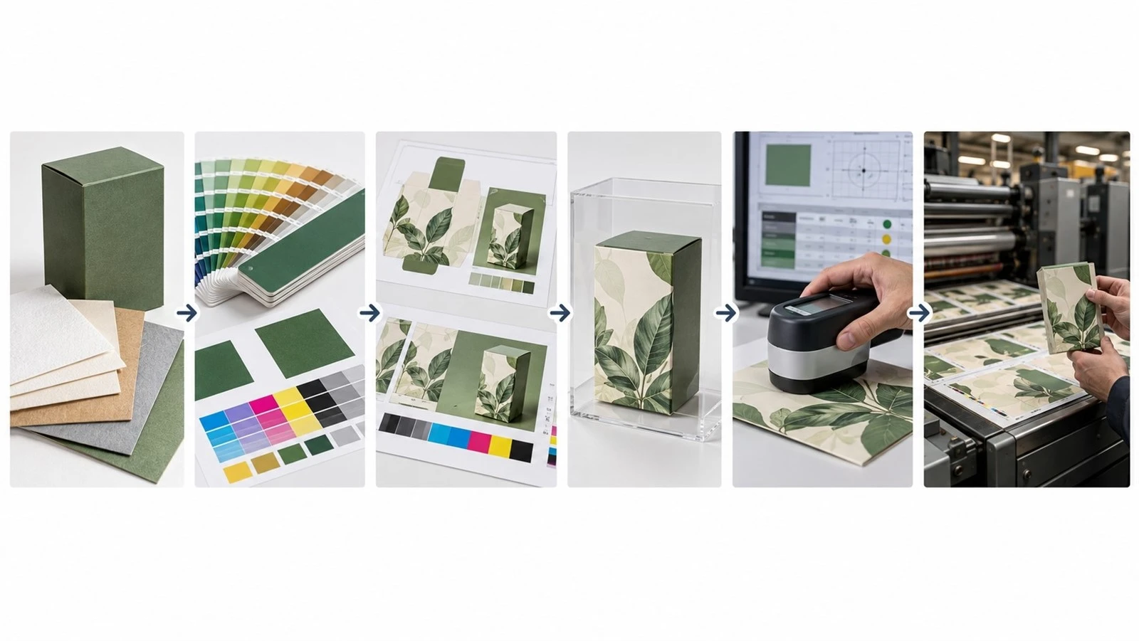
What to Ask Your Packaging Supplier Before Approving Mass Production
A capable packaging supplier should be able to explain how color is controlled from sampling through mass production. The goal is not to ask whether they "have good quality control," but to understand what they actually measure, compare, and record.
Sample and Process Questions
Will the sample and bulk order use the same printing process?
A useful answer should clearly identify the process used for each stage and explain any expected difference between digital sampling and final production.
Will the sample use the same substrate as mass production?
The supplier should confirm the exact or production-equivalent material, not simply say that the paper is "similar."
Color Control Questions
Can you work to a Pantone or other approved color reference?
A strong answer should explain how the target is defined and how Pantone matching is handled during production.
How do you measure color difference?
Look for references to an approved target, measurement equipment such as a spectrophotometer, agreed tolerance, and a documented QC process.
What reference will be used for final color approval?
The supplier should be able to identify whether this is a contract proof, approved physical sample, press proof, or another controlled reference.
Production and QC Questions
How is color monitored during the production run?
A useful answer should describe actual packaging quality control steps, such as measuring, comparing, recording, and correcting color during production.
What happens if production falls outside the agreed tolerance?
The supplier should have a clear procedure for identifying, correcting, and handling out-of-spec output.
How do you maintain color consistency on repeat orders?
Look for retained master samples, approved color specifications, QC records, and controlled artwork versions.
Supplier Evaluation Checklist
Before approving mass production, confirm that the supplier can clearly explain:
the sample and production printing methods;
the final substrate;
the approved color target;
the measurement method and tolerance;
the production QC process;
out-of-tolerance handling;
repeat-order color control.
If the answers remain vague, the color approval process is probably vague as well.
Ask us to review your color-critical packaging specification before sampling.
Even a capable supplier does not mean every project needs a press proof. The next decision is whether the additional cost is justified by the production risk.

When Is a Press Proof Worth the Extra Cost?
A press proof is most valuable when the cost of getting the color wrong is higher than the cost of verifying it before mass production.
The key question is:
Is the consequence of a color mistake significant enough to justify the additional setup cost and time?
Use It for High-Risk Projects
A wet proof or press proof is worth considering when the project involves:
luxury packaging;
brand-critical colors;
large dark or solid-color areas;
high-value or large-volume orders;
an unfamiliar substrate;
a new supplier;
a new printing method.
These projects carry a higher risk because a mismatch could lead to expensive reprints, launch delays, or visible brand inconsistency.
You May Not Need It When...
A lower-cost packaging proof may be sufficient when:
color is not highly critical;
the order is small;
the commercial risk is low;
the job is a stable repeat order;
the artwork is mainly photography or multi-color process work;
the supplier already has a validated and repeatable workflow.
This does not mean CMYK jobs never need a press proof. The decision should depend on production risk, not on the color system alone.
When in doubt, compare the cost of the proof with the cost of a failed production run. If the second number is much higher, the press proof is usually easier to justify.
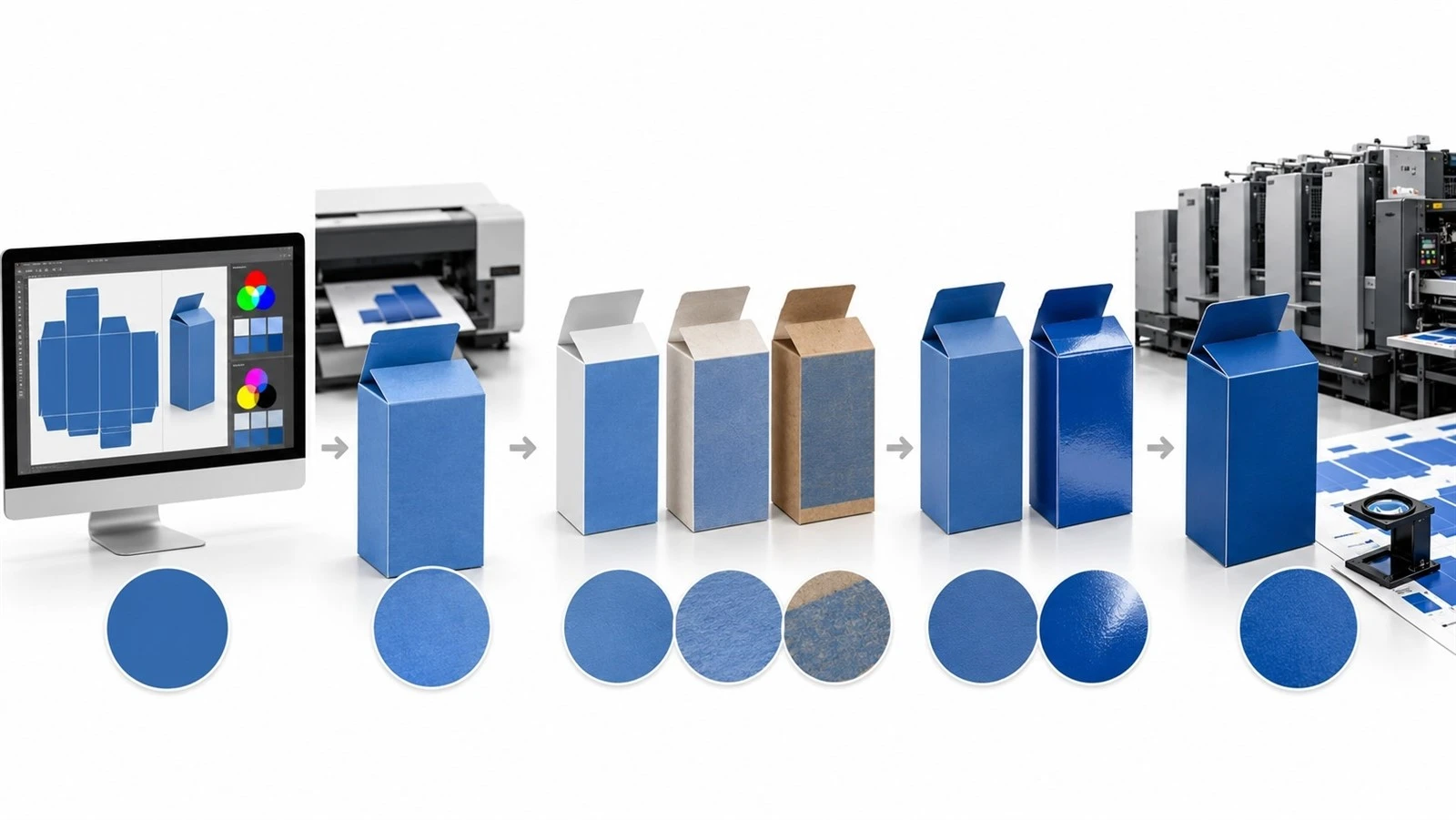
Packaging Color Matching Checklist Before Bulk Production
Before approving mass production, confirm that every color-critical variable has been locked.
Artwork color mode confirmed - Final files are prepared for the intended print process.
Pantone / CMYK specification confirmed - The production team has a clear color target.
Final production substrate confirmed - The approved material matches the bulk-production material.
Final finishing confirmed - Lamination, varnish, or coatings are included in the approval.
Proof type agreed - The proof is appropriate for the level of color risk.
Approved physical reference retained - A clear production target is available for comparison.
Color tolerance defined - Acceptable variation is agreed before production.
Viewing condition agreed where necessary - Critical colors are judged under consistent lighting.
QC method confirmed - The supplier knows how color will be measured and monitored.
Production reference retained for repeat orders - Future batches can be compared against the same approved target.
For buyer teams, this checklist can also be turned into a printable or downloadable Pre-Production Color Approval Checklist.
If these controls are agreed before production, the sample becomes one part of the system rather than the only quality reference.
Final Takeaway: Control the Process, Not Just the Sample
A good-looking sample is not enough to guarantee consistent mass-production color.
Reliable packaging color matching depends on the entire process-from artwork and substrate to proofing, printing, finishing, and production QC.
Before mass production, buyers should define the approved reference, acceptable tolerance, proofing method, and QC requirements. The goal is not simply to approve a sample, but to build a process that can reproduce the approved result consistently.